Huda beauty Neon Obsessions Palettes Swatches
Hello peeps, today’s swatches are Huda’s Neon Obsessions palettes. I had done swatches of her other obsessions palettes before, so check out the links below in case you’re interested.
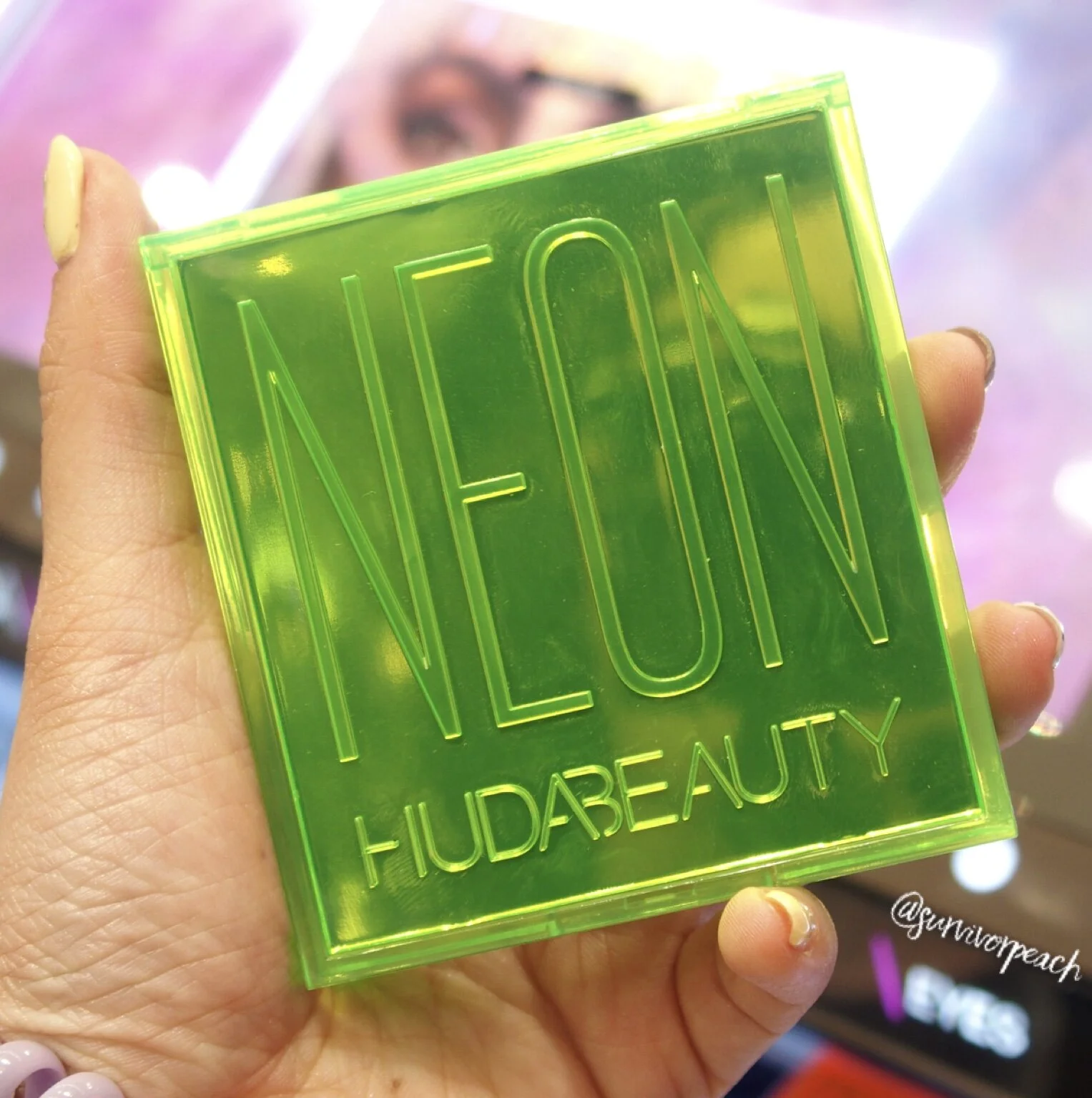
Huda beauty Neon Obsessions Palette Green
Huda says these are “A range of NEON pressed pigment palettes, inspired by Huda’s obsessions for Neon colors, offering versatile looks from subtle to vivid and colorful!”
I think these are definitely non conventional colors are those who buy are probably looking to use these on special occasions only. I mean, I wouldn’t buy these in a million years, cause I’ll never get to use them. But in terms of the eyeshadow quality itself, I think these are pretty good considering that neon colors are (in my personal opinion) harder to to make opaque.
Huda beauty Neon Obsessions Palette Green
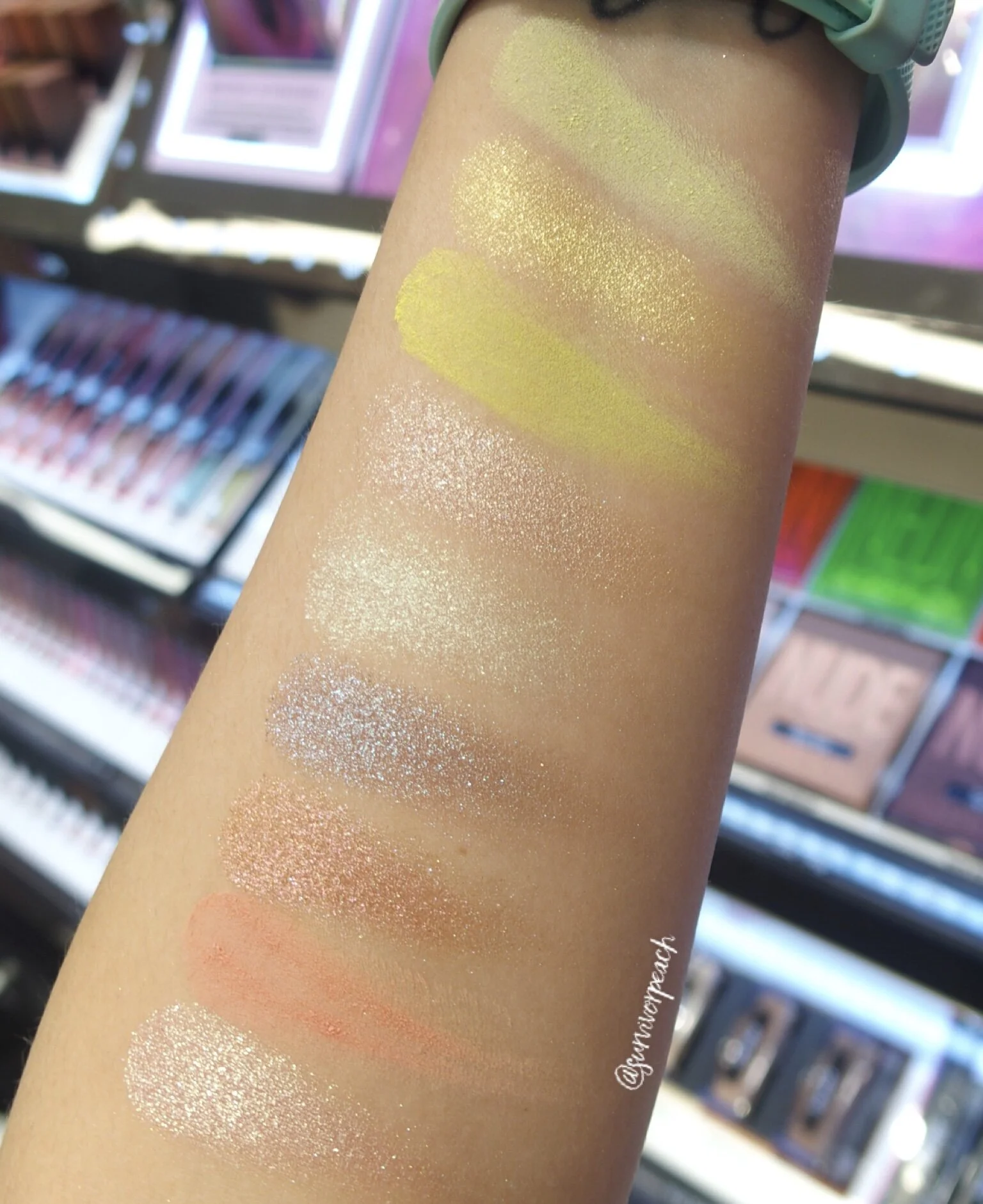
Starting off with Neon Green “A bright collection of 3 buttery matte shades in greens and pinks, 4 yellow and neutral striking shimmer shades, and 2 metallic shades in explosive copper and duo-chrome blue.”
Below are the swatches. Personally I don’t think the Green palette works well. I prefer the pink palette over this.
Huda beauty Neon Obsessions Palette Green swatches
Huda beauty Neon Obsessions Palette Pink
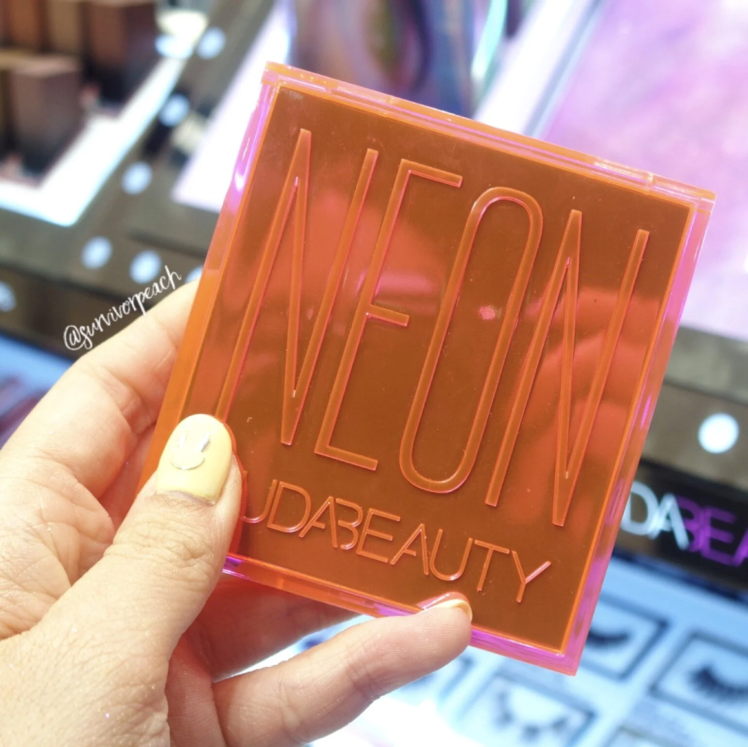
Next is the Pink palette. OK it might look orange on the cover, but the edges are kinda pink (and also my camera couldn’t capture the color accurately).
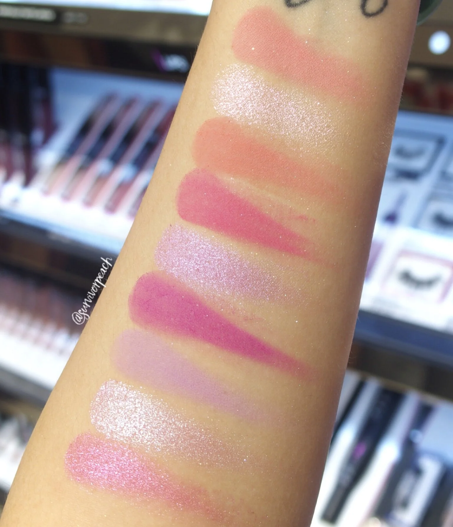
“This vibrant neon pink palette offers 5 buttery matte shades in bold pink and purple hues, 3 creamy metallic shades and a striking shimmer shade for maximum effect!”
Huda beauty Neon Obsessions Palette Pink
Now I think the quality of this palette is great! The matte shades are very opaque and had good color payoff and they really are neon.You get a mix of peaches and pinks in this palette which is a good combination. I can see Tokyo-Kawaii looks with this palette.
Huda beauty Neon Obsessions Palette Pink swatches
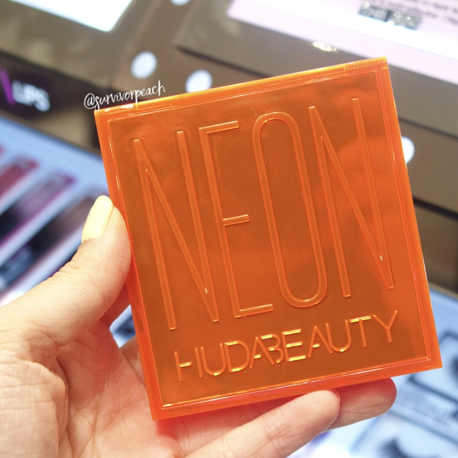
Huda beauty Neon Obsessions Palette Orange
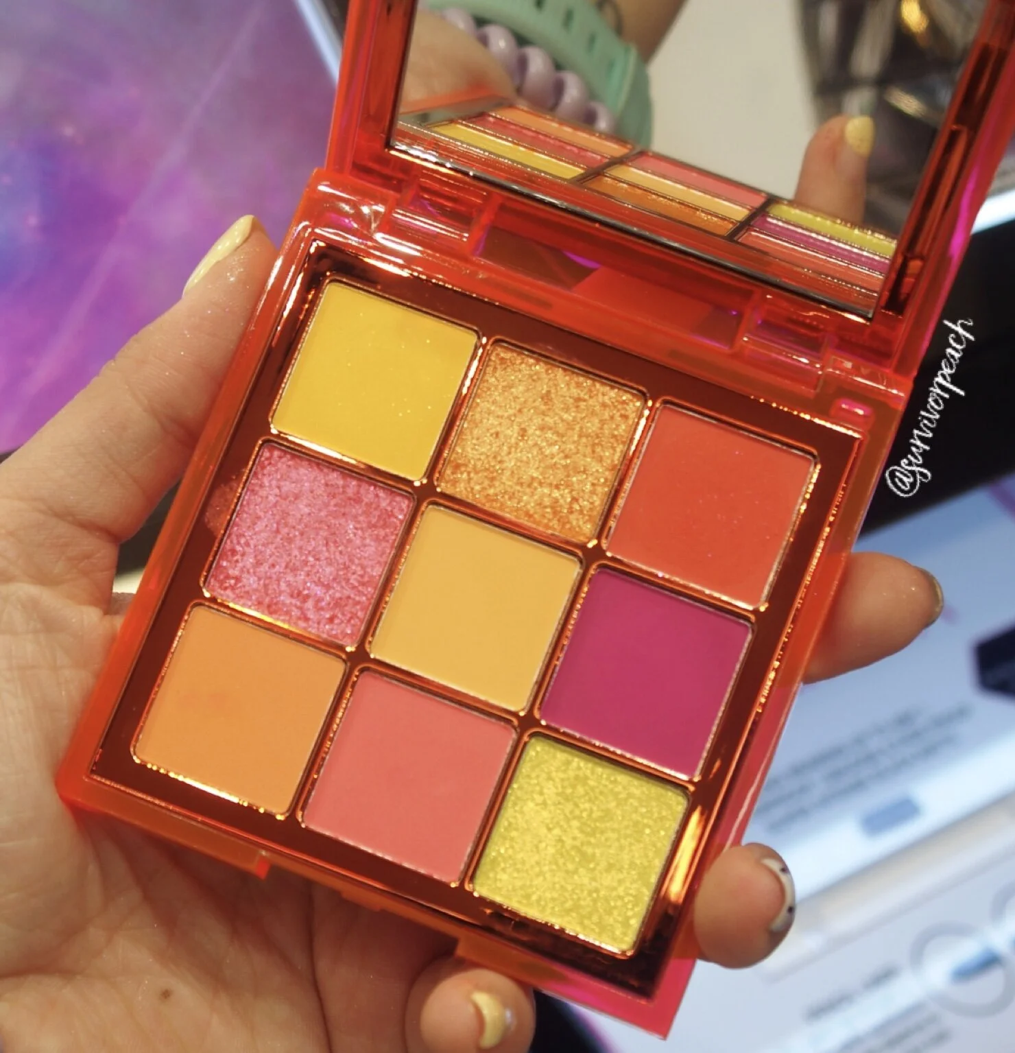
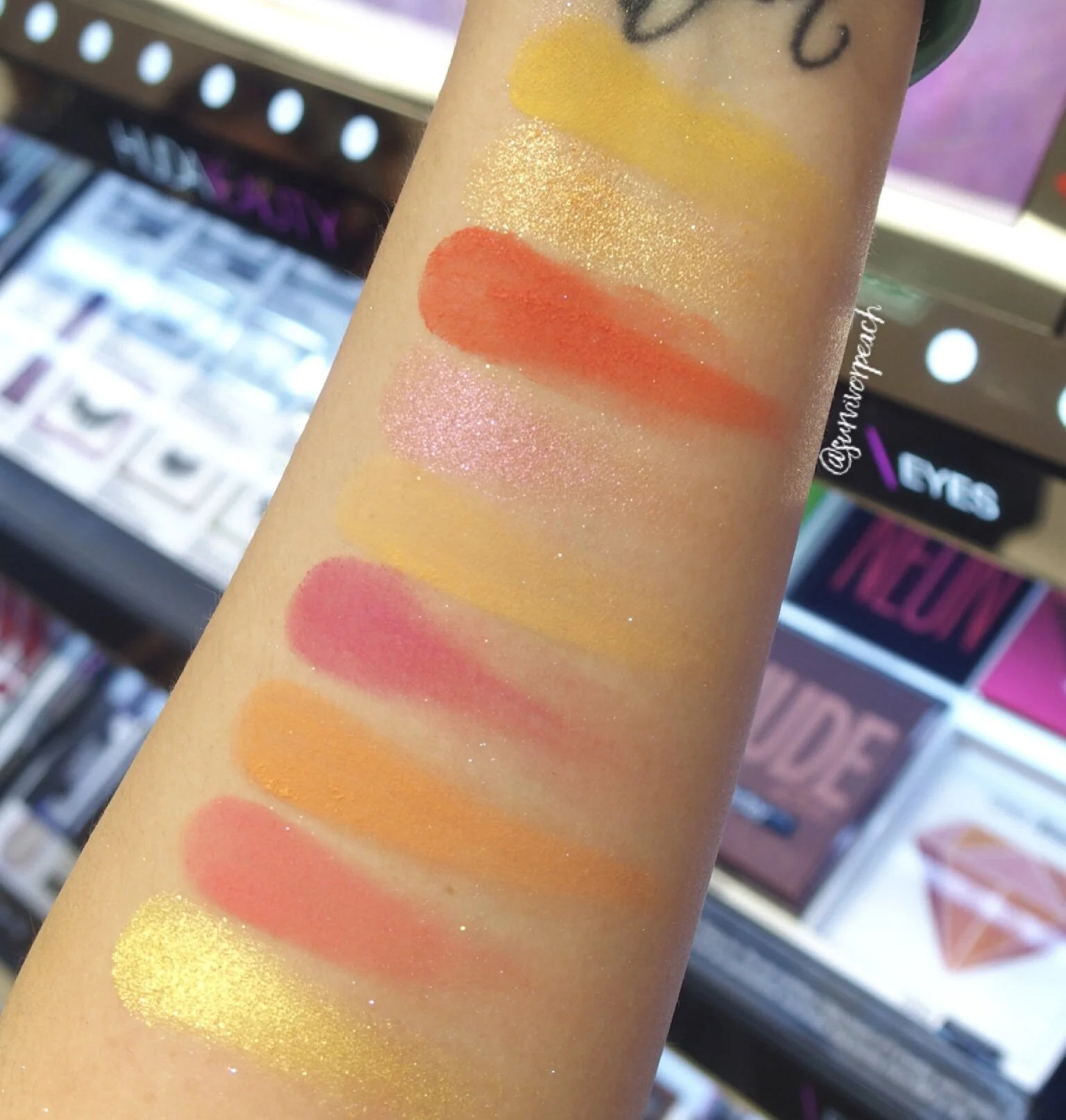
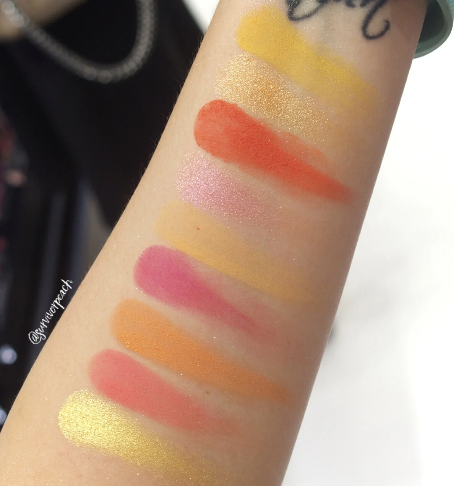
And finally, Neon Orange. This palette also has some pinks and peaches and yellows, but in my opinion doesn’t really scream Neon. It feels like another warm palette that’s more bright. At the same time, this is what makes this palette easiest to use out of all three.
“A tropical combination of 6 buttery matte shades in eye-popping yellows, oranges, and pinks, perfectly complimented with 3 creamy metallic shades of the same color palette.”
Huda beauty Neon Obsessions Palette Orange
Swatches below from two different lighting.
Huda beauty Neon Obsessions Palette Orange swatches
Huda beauty Neon Obsessions Palette Orange swatches
So overall, if I had to pick one, I’d go with the Pink palette. If you want a more easy to use palette, go with orange.

